
Imagine being able to generate a plot with only one line of code.
After I had spent some time coding in Python and generating plots in Matplotlib, I decided to make some shortcuts for each time I wanted to see a simple plot. Although plot_assistant was born in 2017, I've only recently stripped it down, polished it up, and made it available on GitHub.
Instead of showing you the functions in plot_assistant (you can just look at them here if that's what you came here for), I'll take you through an accompanying script (examples_for_plot_assistant) that showcases plot_assistant's efficiency.
First we will import the libraries that we will be using:
import numpy as npimport matplotlib.pyplot as pltimport matplotlib.ticker as tickerimport plot_assistant as pa
You'll need to have plot_assistant in the same directory for this last import to work. The other libraries (Numpy and Matplotlib) come with Python.
Next we need some data (that we will later plot). Feel free to use your own data instead or modify these lines.
x = np.linspace(0, 10, 100)y = np.sin(x)z = np.exp(-x/2)
If we now want to plot y as a function of x, it's possible to do that with only one line of code!
pa.quick_plot(x, y, 'example', 'x', 'y')
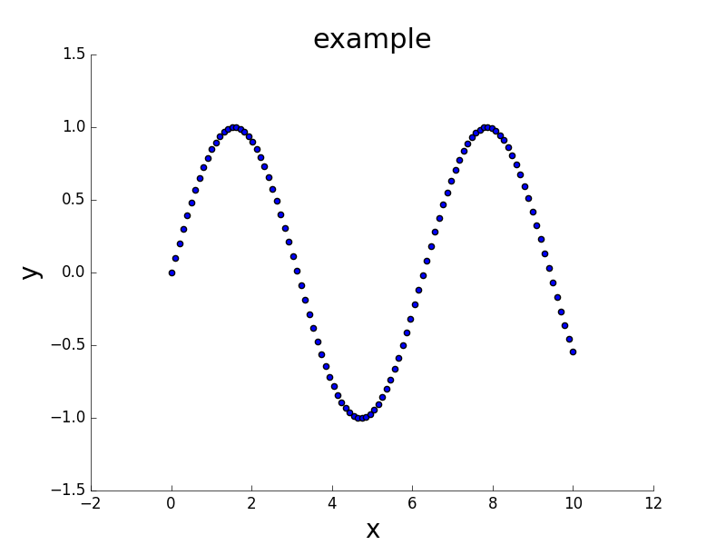
This will most likely not be the final plot you use in a presentation, but the point is that you get to see the relationship between x and y ASAP.
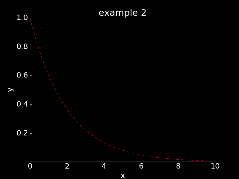
Another neat feature is dark mode. Especially if you want to present a plot on a screen, you can give it a black background. Now that you have already seen the quick_plot function, I will take you through the different functions it calls.
fig, ax = pa.initialize_plot(True)
By including True (or 1), we are passing the boolean that tells initialize_plot to give it a black background.
fig, ax = pa.title_and_axes(fig, ax, 'example 2', 'x', 'y', x[0], x[-1], np.amin(z), np.amax(z))
The title_and_axes function allows us to give the plot a title, label the axes, and set the axes' limits (should we decide not to use the default limits) with only one line of code.
ax.plot(x, z, 'r--')pa.save_and_clear_plot(fig, [ax], 'example_2', 'png', True)
The save_and_clear_plot function saves the plot with the filename and extension we give it. I prefer the pdf extension for finalized and polished plots, but png files work fine for quick visualizations of the data.
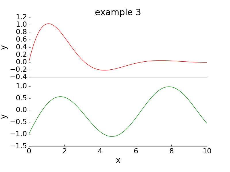
For the last part of our tour through examples, I'll show you how you can still use the title_and_axes and save_and_clear_plot functions even if you want to use multiple subplots.
fig = plt.figure()ax1 = fig.add_subplot(211)ax2 = fig.add_subplot(212)fig, ax1 = pa.title_and_axes(fig, ax1, 'example 3', '', 'y')fig, ax2 = pa.title_and_axes(fig, ax2, '', 'x', 'y')ax1.xaxis.set_major_locator(ticker.NullLocator())
The previous line removes x-tick labels from the top plot because they coincide with those of the bottom plot in our case.
ax1.plot(x, 2*y*z, 'r-')ax2.plot(x, y-z, 'g-')plt.subplots_adjust(bottom=0.15, top=0.9, hspace=0.15)
The previous line customizes the subplot positions so that axis labels are not cut off. Now we are ready to save the plot.
pa.save_and_clear_plot(fig, [ax1, ax2], 'example_3', 'png')
Again, you'll typically want to customize plots further if they'll be shown in a presentation. If you find that you like to repeat certain customizations, consider writing them as a function that you add to plot_assistant or whatever other file you want to include.
Happy plotting!